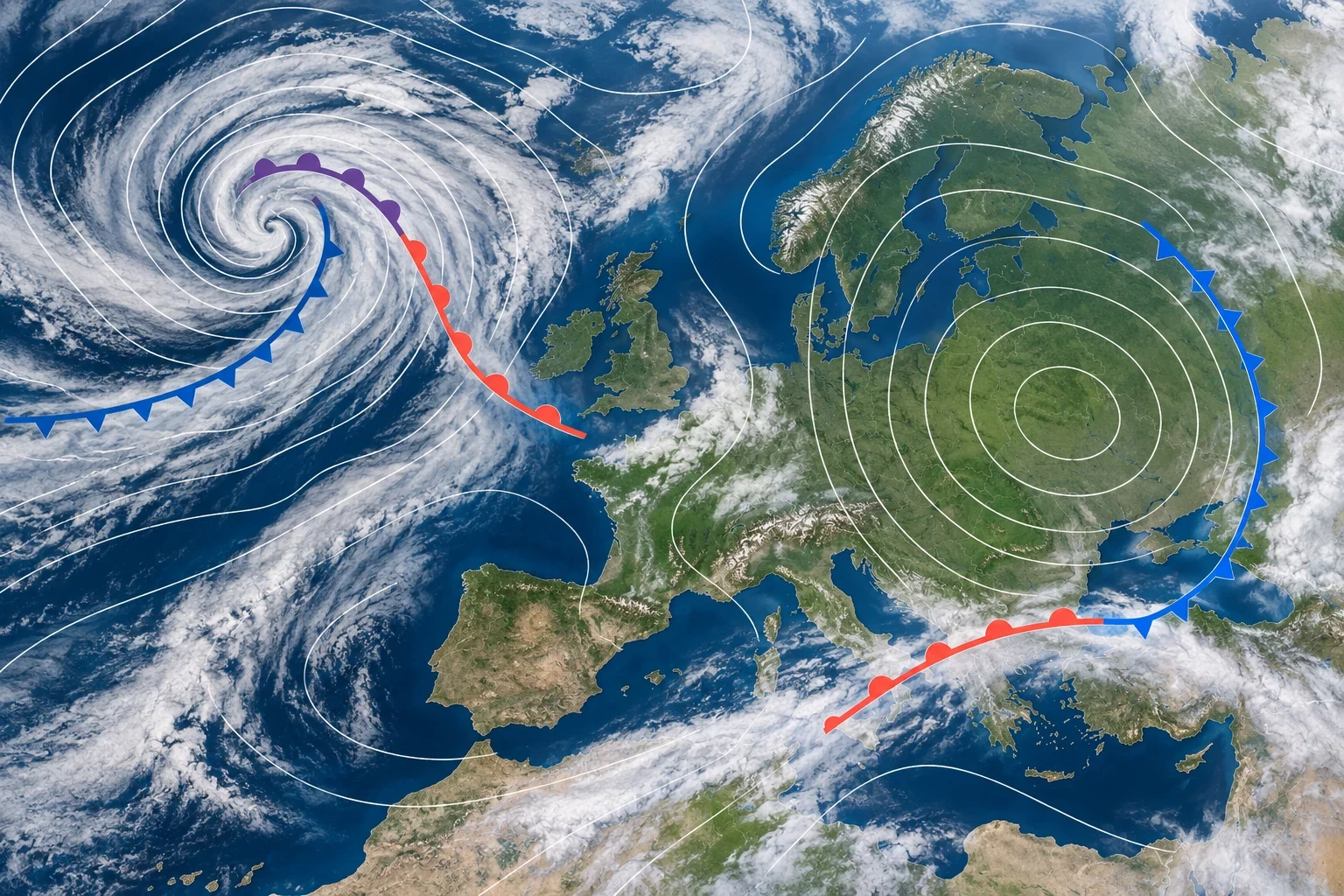
A synoptic chart summarises the atmosphere across a large region. Its lines and symbols reveal pressure systems, fronts and areas where a strong pressure gradient may support stronger winds. It is not an exact picture of the weather in every town, and it does not replace a detailed forecast or official warning.
Start with time and chart type
Check the valid time and time zone before reading any symbol. An analysis chart estimates the atmospheric state from observations; a forecast chart shows the modelled situation at a future time. Also check whether pressure is reduced to mean sea level and the interval used between isobars, as products do not all use the same spacing.
Isobars: lines of equal pressure
Isobars connect points with the same atmospheric pressure, normally in hectopascals. A number on one line does not by itself predict sunshine or rain. Read the pattern and spacing.
- Closely packed isobars: a strong pressure gradient, generally supporting stronger wind.
- Widely spaced isobars: a weaker gradient and generally lighter wind.
- Closed curves: these may surround a high- or low-pressure centre.
Spacing cannot give an exact gust for a location. Terrain, friction, local breezes and showers alter surface wind. See our guide to atmospheric pressure and hPa changes for the underlying measurement.
High and low pressure do not simply mean sun and rain
In the Northern Hemisphere, air circulates broadly clockwise around a high and anticlockwise around a low. Near the surface, friction causes the flow to cross the isobars slightly towards lower pressure rather than follow them perfectly.
A high favours sinking air and settled conditions, yet it can trap fog, low cloud or pollution below an inversion. A low favours rising air, cloud and changeable weather, but rainfall also needs moisture, lifting and often fronts or instability. One H or L cannot describe local weather by itself.
Understanding fronts
- Cold front: triangles point in the direction of advancing cold air. A relatively narrow band of cloud, rain or showers may accompany it.
- Warm front: semicircles point along its movement. Cloud and precipitation can spread well ahead of the line.
- Occluded front: triangles and semicircles share one side. It forms as the cold front catches the warm front and lifts the warm sector.
- Stationary front: symbols sit on opposite sides and the boundary moves little. With enough moisture, cloud or rain may persist.
A drawn front does not guarantee rain along its full length. Equally, thunderstorms can develop away from fronts where heat, moisture and instability combine.
A six-step reading method
- Check valid time and whether the chart is analysis or forecast.
- Locate highs, lows and their central pressures.
- Follow the isobars and identify the tightest gradient.
- Identify each front and its direction.
- Place your location relative to the systems, not merely under a symbol.
- Compare the pattern with local forecasts, radar and current warnings.
A worked example
Suppose a low lies west of Iberia, isobars are tightly packed over the Atlantic and a cold front is moving east. The chart suggests stronger winds where the gradient is tight and a change of air mass near the front. It cannot tell you the exact rain time, total or strongest gust in one town. Those details require higher-resolution forecasts and current warnings.
Our guide to mean wind and gusts explains why brief maxima differ from the general flow.
Common mistakes
- Reading an old chart as current.
- Assuming a low means continuous rain everywhere.
- Converting isobar spacing into an exact gust.
- Treating the front line as the precise edge of rain.
- Using a synoptic chart instead of official warnings.
Official sources and safe use
The Met Office guide to synoptic charts explains the symbols, and its surface pressure charts provide analyses and forecasts. Use them for the broad pattern, then consult the responsible weather service and civil-protection authority before exposed activities or travel.